Three conversion-focused updates to the Go Pure store, each built to remove one point of friction and proven through testing. Together they grew subscriptions, order value and trust in the brand.
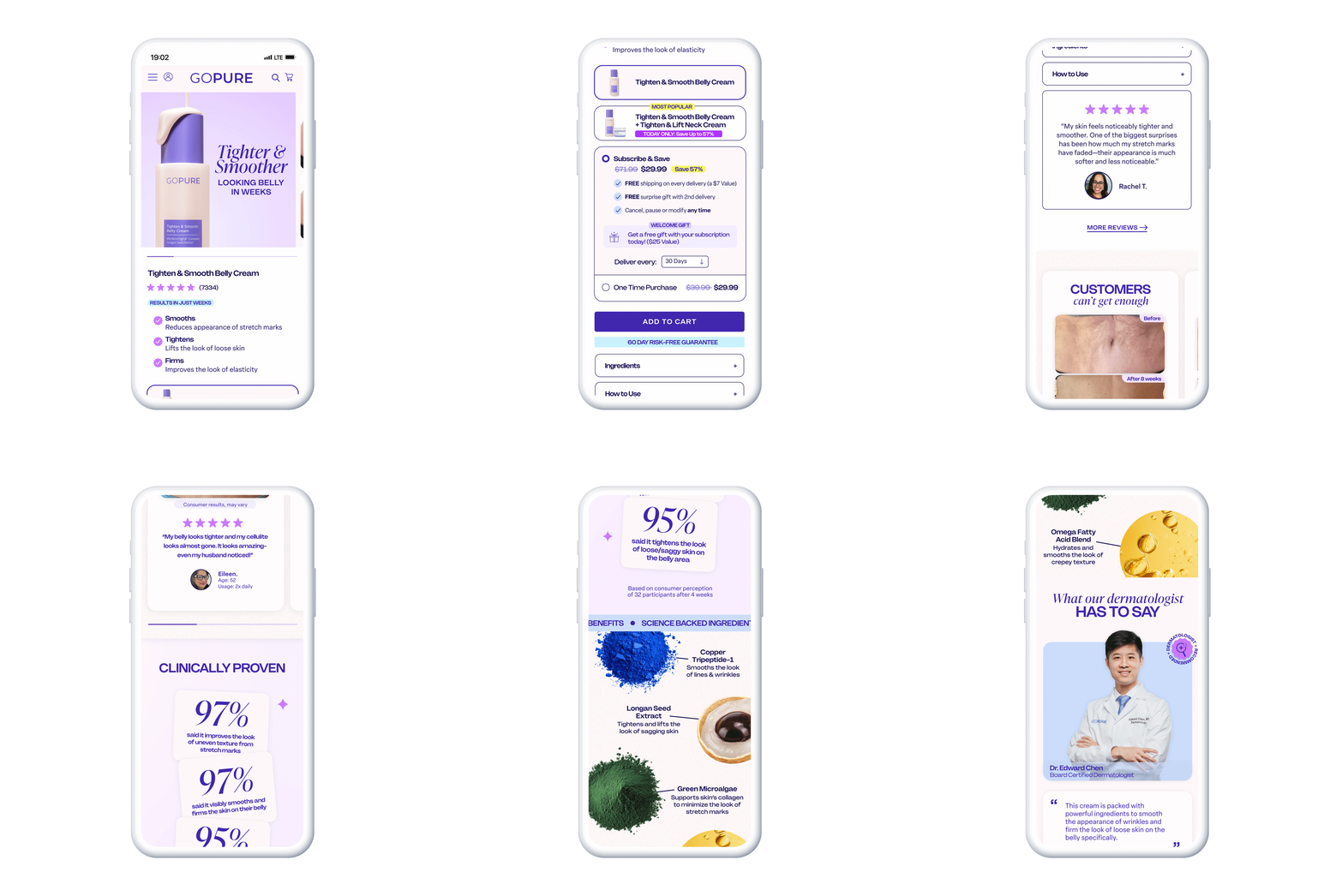
Shoppers couldn’t quickly see what the cream does or how bundles and subscriptions save money, so many left before choosing an option.
One clear buy box: key benefits up top, the bundle upsell next, and Subscribe & Save with the savings shown at a glance.
Tested the new product page against the previous layout, with traffic split evenly, and tracked add-to-cart rate and average order value.
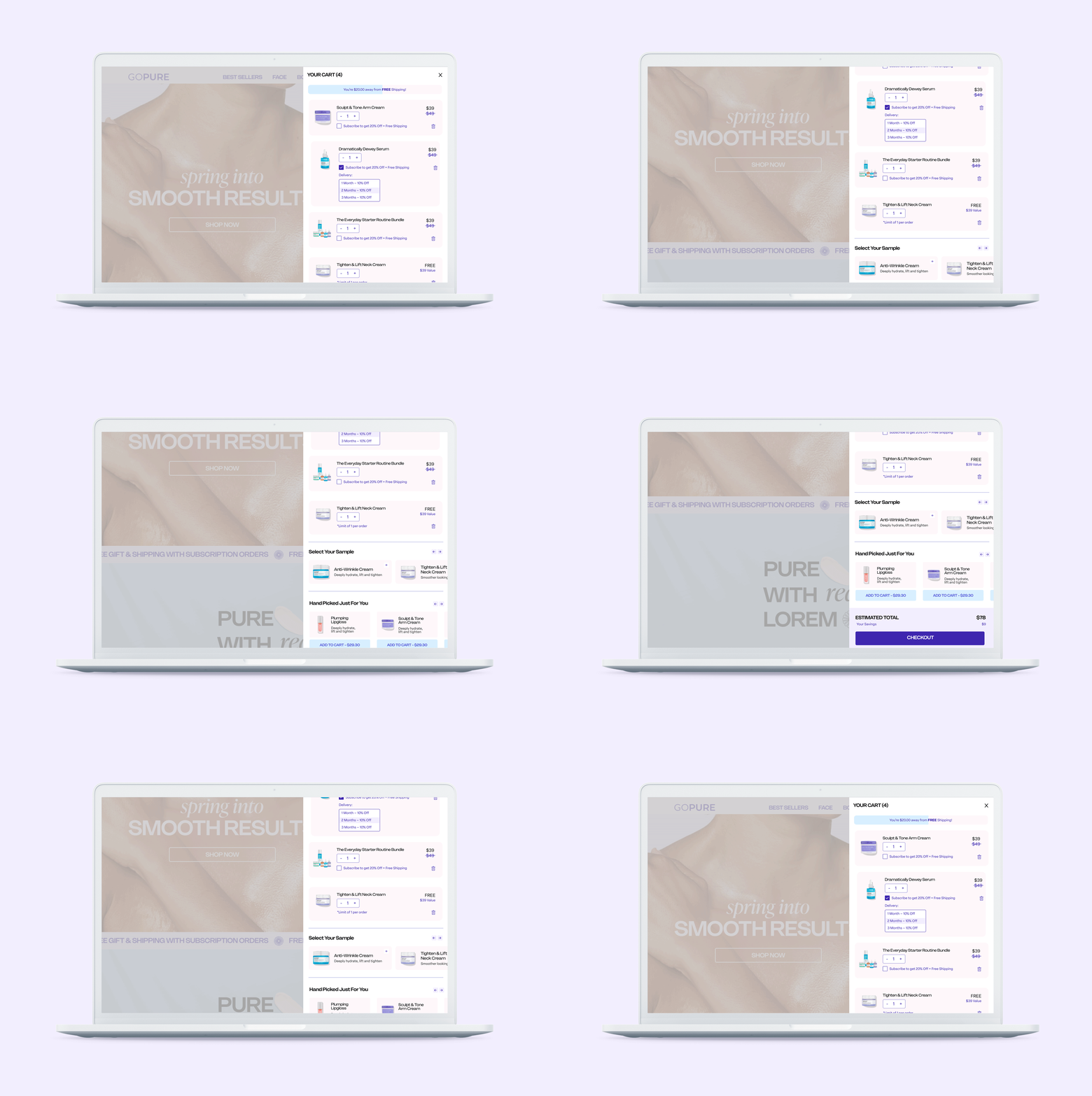
Subscription and trial offers only lived on the product page, so shoppers who went straight to the cart never saw them again.
Each cart item can switch to Subscribe & Save in place, with delivery frequency and savings tiers, plus a Try Before You Buy option for new customers.
Tested the upgraded cart against the standard cart and tracked subscription rate and checkout conversion.
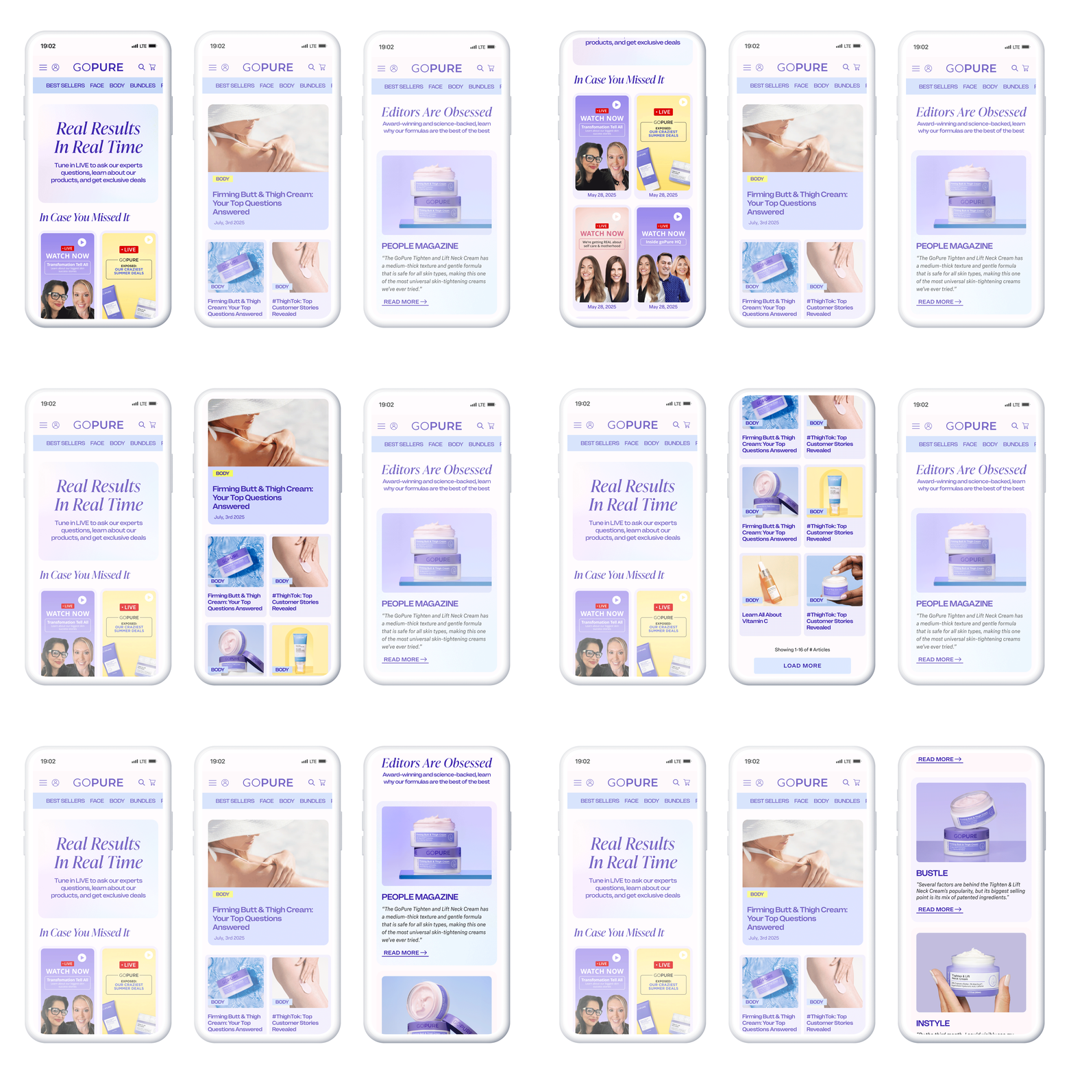
Expert advice, real results and press mentions were scattered, so new shoppers had little proof the products work.
A live-shopping video gallery, a body-care blog and a press page, each linking straight back to the products they talk about.
Compared conversion for shoppers who viewed the new content against those who didn’t, and tracked engagement on each page.
 THANK YOU